violateraindrop (![[personal profile]](https://www.dreamwidth.org/img/silk/identity/user.png) violateraindrop) wrote2008-06-24 03:53 pm
violateraindrop) wrote2008-06-24 03:53 pm
Entry tags:
Tutorial #02
I can't believe that I'm really posting the tutorial already :D
To be honest: I'm a little proud of myself :P
My second tutorial (requested byminuh and cici_chan ).
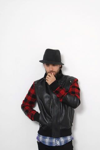
Going from to
to 
Made with Photoshop, includes Selective Coloring and Color Balance.
To be honest: I'm a little proud of myself :P
My second tutorial (requested by
Going from
to Made with Photoshop, includes Selective Coloring and Color Balance.
Step 1
Take your picture crop/resize etc. I found my base in this post.
Step 2
Duplicate your base and set it to Screen at 50% opacity.

Step 3
Duplicate your base again and set it to Soft Light at 50% opacity.

Step 4
Add a Selective Coloring layer with the following settings:
Reds: -20 / +14 / +26 / +4
Yellows: +38 / +34 / +26 / +30
Whites: +42 / +39 / -13 / -7
Neutrals: -5 / -1 / -1 / +1
Blacks: +23 / +13 / +4 / -4

Step 5
Add a Color Balance layer with the following settings:
Midtones: -19 / +6 / -12
Shadows: +11 / -9 / +17
Highlights: -9 / +3 / -1

Step 6
Add another Selective Coloring layer with the following settings:
Whites: -20 / -20 / -20 / -20
Blacks: +20 / +20 / +20 / +20
(I use this kind Selective Coloring layer very often to add some contrast to the icon, so I guess there are many other possibilities to get the same effect)

Step 7
Add a color fill layer (#B8D1FF) and set it to Darken at 50% opacity.
 ->
-> 
Step 8
Duplicate your base for the last time, bring it on top, desaturate it and set it to Color Burn at 10% opacity and your done.
Feel free to ask questions and I'd love to see your results!
Take your picture crop/resize etc. I found my base in this post.
Step 2
Duplicate your base and set it to Screen at 50% opacity.
Step 3
Duplicate your base again and set it to Soft Light at 50% opacity.
Step 4
Add a Selective Coloring layer with the following settings:
Reds: -20 / +14 / +26 / +4
Yellows: +38 / +34 / +26 / +30
Whites: +42 / +39 / -13 / -7
Neutrals: -5 / -1 / -1 / +1
Blacks: +23 / +13 / +4 / -4
Step 5
Add a Color Balance layer with the following settings:
Midtones: -19 / +6 / -12
Shadows: +11 / -9 / +17
Highlights: -9 / +3 / -1
Step 6
Add another Selective Coloring layer with the following settings:
Whites: -20 / -20 / -20 / -20
Blacks: +20 / +20 / +20 / +20
(I use this kind Selective Coloring layer very often to add some contrast to the icon, so I guess there are many other possibilities to get the same effect)
Step 7
Add a color fill layer (#B8D1FF) and set it to Darken at 50% opacity.
-> Step 8
Duplicate your base for the last time, bring it on top, desaturate it and set it to Color Burn at 10% opacity and your done.
Feel free to ask questions and I'd love to see your results!
no subject
Lovely result ;)